Wednesday, 19 January 2011

'How did you use media technologies in the construction and research, planning and evaluation stages?'


Fortunately, today's society evolves around technology where it is used not just for leisure but in the workplace as well. As part of research and planning, it was essential for us to find music videos which were relevant to our genre to gain ideas to incorporate to our own video. 


Youtube played a big part in terms of viewing different indie music videos and the extra features such as the amount of views allowed us to see how successful the video was. It is a well-known site where people can share and upload videos. Increasingly, it is becoming popular for new, upcoming artists to share their music and gain support from the public. The use of likes/dislikes and comments used when viewing the video allows the artist to see how the video is being perceived.  


Google also helped me find images of indie artists' digipaks and advertisement enabling me to see what features were most commonly used. This helped me during the research and planning process because I was able to gain inspiration from other digipaks and apply to my own. 


Ellie Goulding's 'Lights' was a big influence on my work because I found the simplicity of the black and gold theme appealing and stood out. 


I used Blogger to create the blog to feature the music video and online track in progress of producing the video and ancillary texts which was very easy to use. Relating to artists in the music industry, blogging is a good way of communicating with their fans and getting an immediate response from them. From the audience's point of view, this builds on the interaction already established between the artist seeing them on a personal level. 


As part of research, we used a digital camera to take different shots and angles which we would use when shooting our music video. This was then created into an animatic showing the audience an idea of what the video would look like. 
To shoot the video, we used a Canon video camera with extra memory cards to store the footage onto. It was a good learning experience for me to use the camera to shoot different shots and angles suiting to the tone of the song. The memory cards allowed us to shoot as much footage as we could, giving us a range of shots and angles to work with in editing. 


To edit the music video, we used Final Cut Pro which is an editing program where we could apply transitions and effects onto footage. We could change the position of the way the footage is appeared on screen and this is evidently seen in our video where the close-up of Imogen's lips is seen to be moving left to right slightly. To improve this shot, we could film extra shots of the close-up scene with her not moving as the current shot shows bad framing. 

Photoshop was used for the construction of the ancillary products where I was able to apply to crop pictures and apply text. I used the 'magic wand tool' to crop out the image from the photo we took of Imogen to transfer onto the digipak front cover. As having a black and gold theme, I used a black background with gold font where I wanted to make the digipak look simple yet eye-catching. With the advertisement, I wanted to continue the black and gold theme to make sure there was a clear visual link between the two texts. This makes it easier for the audience to connect the artist with the texts establishing their public image. 


I also used Photoshop to produce the animatic where we were able to make a clip inserting images onto the soundtrack. This gave us a chance to plan the sequence for the video and test how we would film the different angles making sure they worked together.  Alternatively, we could also experiment with transitions and effects that we were mostly likely to use in our video. 


Tuesday, 18 January 2011

Evaluation 3: How did you use media technologies in the construction and research, planning and evaluation stages?

Throughout the filming process, me and my group have used many different types of media technologies, such as new video cameras and memory cards, so we had to learn about how to use them, as there were many buttons and commands to master.


For example, there were controls for the focussing of the shots, which was important for the final outcome of the music video. Coinciding with this was the zoom, as we learnt that the more you zoomed in, the lower the quality of the shot got, so we put the camera closer to Imogen, rather than zooming at any point.
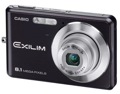
We used a digital camera, like the one above, to capture moments during filming to upload on our blog. This helped us keep up to date on our locations and other shots we could include in the video


There was also the matter of converting our videos to MP4 Quicktime from Final Cut Pro, as it made it easier to upload them onto our blogs, also, it made them smaller and therefore easier to screenshot. However, doing this made the quality worse, and sometimes meant the video was pixellated.


We also used Blogger, although I was already confident on this, so I knew what I was doing. On the other hand, I had to work hard to make the blog look interesting and make people want to read it. To do this I put pictures, videos and other media up, as well as changing the font colour to make important information stand out more to the reader.


I also used the internet for research purposes, including websites such as YouTube and Vevo to find other music videos, and to watch other videos by our chosen artist, Marina and the Diamonds, to see what sort of style we should use.


To edit our video, we used Final Cut Pro. As I had already used it in my AS year I was quite confident with the editing, cutting and changing of all our shots. We didn't use any filters in our video, but we could have used selective colours at certain points to make Imogen stand out more. We also used Final Cut to make an animatic of our storyboard, showing how our video was going to be made.


During the making of my digipak, me and my group used a lot of different programs to make it the best we could. I started out by drawing my planned digipak, which isn't a media technology, but it helped me get an idea of what I wanted to do and work out how to do it.


Next was Adobe Photoshop, which had a lot of effects to add onto images. I used the spotlight tool to lighten Imogen's face so much that some of her features couldn't be seen, allowing me to put the name of the album and the artist in that place.


I also so used Imogen's tablet to draw the two trees on the inside panels. This allowed me to draw exactly what I wanted, rather than try to recreate it on Paint, or find what I wanted on Google Images. I had never used a tablet before, and it made me realise that not everything needs to be done on Photoshop to look good or how you want it to look.

'What have you learned from your audience feedback?'

audience+feedback.jpg (839×547)


This image shows comments which the audience that viewed the music video made which attracted them. People felt the steady use of camerawork allowed the video to have a clear narrative which was important especially as the way we chose to film the roundabout scene was difficult to position steadily. For the aim of the video we wanted the theme of loneliness to be portrayed in the song. This is shown through the character wearing 'outlandish' clothing. We wanted the audience to empathise with the character so to persuade this feeling, we used close-ups to show the emotion. The variety of camera shots such as high angle, close-ups and mid shots also stood out to the audience making it visually interesting for them to watch. 


However, some people commented on the fact that the close-up shot of the lips was repeated too many times during the video. I think the shot itself wasn’t very effective as it was quite out of frame and looked odd on screen.


When looking at the finished video of ‘The Outsider’, I think we could have a more vivid shot instead of the bridge scene because the tempo of the song starts to build up and this is not reflected enough on screen.


In the roundabout scene, I can notice some issues with the natural lighting which makes the artist look dark and the emotions are not visible. This is due to the fact that the weather was constantly changing which can be seen in the video so to improve on the shot, I would have filmed the roundabout scene as a base track more times. This would allow the audience to actually see her emotion through facial expressions better. 


In the last scene, with the dissolve effect on the roundabout, there was an mise-en-scene issue where the audience can see the ‘Sainsburys’ logo very evidently.  However, this links the audience with the video to the location but throughout the course of the song, park imagery is existent making the artist to appear odd. 

Sunday, 16 January 2011

Feedback from draft evaluation

Hello
You'll find comments from me under each of your individual evaluation blog entries.  Click on the '1 comments' link at the bottom of each blog to reveal my comments. 
Keep up the good work (and Imogen - please do some....)

Saturday, 15 January 2011

Evaluation 2: How effective is the combination of your main product and ancillary texts?

I made sure that my album artwork and advertisement were strongly related to each other, as this is how artists do it for magazines, etc. I used the same photograph of Imogen with the same effects and fonts on to help the audience connect the two together. I also stuck with the same colour scheme, with red and blue writing. This meant that, had the advertisement been incorporated in a newspaper, it would easily remind the audience of the album, maybe boosting album sales, and therefore tour ticket sales.
Another example of this is the Villagers album, Becoming the Jackal, which uses the same green colour scheme and font type throughout the advertisement and album artwork. The only difference is that the advertisement uses a picture of the artist, as the album doesn't, and it allows the audience to see who they are listening to. This style of connecting ancillary products had a big influence on me, meaning I took the style on board and used it in my own work.

To keep the whole thing connected, Imogen is wearing the same bright green eye make up in the photo on the front of the album/advertisement as she is in the music video, helping the association of the products become clear. Also, on the inside panels of the digipak, I have two pictures of trees, one in bloom during spring/summer, and the other bare in winter, this contrast links in with the video as it is reminiscent of the reverse slow motion shot of Imogen throwing/catching the leaves, as well as it being autumn when we filmed, so there were leaves all over the ground in most shots.
I originally planned to put a roundabout in the background of the drawings of the trees on the inside of my digipak to be reminiscent of the video, but, it seemed not to fit very well with the whole style of my digipak, so I removed it for the final product.

Evaluation 1: In what ways does your media product use, develop or challenge forms and conventions of real media products?

For the music video,  we were inspired by a number of artists' videos, including the three shown below.
This song,by the Oxford band Stornoway, gave us the idea of filming Imogen on a roundabout, with the background moving and the artist staying still. I think this works well as a shot because it helps establish Imogen as the main singer and artist involved with the song. The moving background is irrelevant to the audience, so it does not need to be still and distracting.
This is a screen shot from our music video, at a part where Imogen is on the moving roundabout. There are things in the background such as trees and a children's playground, but as they go by quickly they are symbolised as being unimportant to the narrative. This happens again when Imogen is walking through a crowded street in slow motion and the people aren't noticing her, as if she isn't really there at all.

This shot was in slow motion as it helps to establish the character's role and place in society; she is an outsider, and unlike the other people on the crowded street, is on her own, showing that she is different to them. 

The video for Massive Attack's song Unfinished Symphony gave me and my group ideas on what to do for our music video. We originally planned to film Imogen walking from Waterloo to London Bridge continuously, like this video does. We felt that this technique would work well as an establishing shot for our artist, showing where she is from and how she is and outsider from the rest of London by dressing her in odd-looking clothes to make her stand out.


However, we later decided that this was too ambitious, as we didn't have the equipment or permission to film a continuous walking shot in central London. This meant we had to think of a new idea for our video, so we encompassed the shots of iconic parts of Central London with other video types, such as  the extreme close up on the lips and the reverse slow motion shot with the leaves.


The final video, blink-182's video for Always was an inspiration as the way it cuts between the scenes makes it look like a continuous shot throughout the whole video, though it is in three separate parts that occasionally join together, like at the start and end of the song. We originally wanted to do something like this for our video, but we didn't have the time or space to make such a complicated video, instead we filmed a number of base tracks going throughout the song, like on the roundabout to cut back and forth between.


These albums covers all have their main artist o the front cover of their respective albums, and so does mine. However, my front cover has a photograph of Imogen up closer and slightly tilted to the right hand side, and her face lightened, like on The Libertines' front cover. Like on Jack Penate's album, I have used the same colour font for the album title and artist's name, to keep in touch with the colour scheme. He has also made the artist's name bigger than the album's title, so any first time listeners are not confused, and know that the person on the cover is the artist themselves. The Darwin Deez and Morrissey albums are both very simple as well, as they just show us who the album is by and, in Morrissey's case, the name of the album. All have lighting effects on, but none are as prolific and obvious as mine, where I used the spotlight tool on Photoshop to eradicate some of Imogen's features.